Origin of the Name “Kyorin”
The name Kyorin originated from two Chinese characters that represent a truly virtuous way of practicing medicine. It is derived from Chinese folklore (Shinsen-den), and embodies the Kyorin Group’s aspirations to continuously contribute to people’s better health in any day and age.
Kyorin Legend
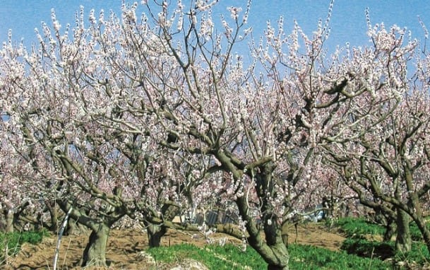
Long ago, a Chinese physician named Dong Feng treated the sick free of charge, and asked those who recovered from serious illness to plant five apricot tree saplings and those cured of minor illness to plant one.
As time went by, a thick forest of apricot trees was formed in the area. (A story that comes from a Chinese legend named Shinsen-den.) “Kyorin” is a compound of “kyo,” the Chinese word for “apricot,” and “rin,” the Chinese word for “woods.” Praising the virtue of Dong Feng, the characters were transported from China to Japan as those representing medicine and medical treatment in general.
Brand symbol
![]()
Passion embedded in the brand symbol
The brand symbol conveys the image of “Smiling society” to which the Kyorin brand is committed, and to achieve this, Kyorin’s determination to take “Flexible and bold actions” and its desire to be externally “Trusted and reliable.”
Corporate Mark
The corporate mark consists of three curved lines that form a heart shaped apricot. The lines represent the smiles of patients, their families, and workers in medical services, as well as Kyorin’s three core businesses, namely prevention, treatment, and prognosis.
- Orange : Honesty and warmth
- Violet : The technology that brings confidence
- Light green : Free and lively creativity
Company name logotype
Familiarity, freshness, vitality and dynamic font style is applied to the logotype.
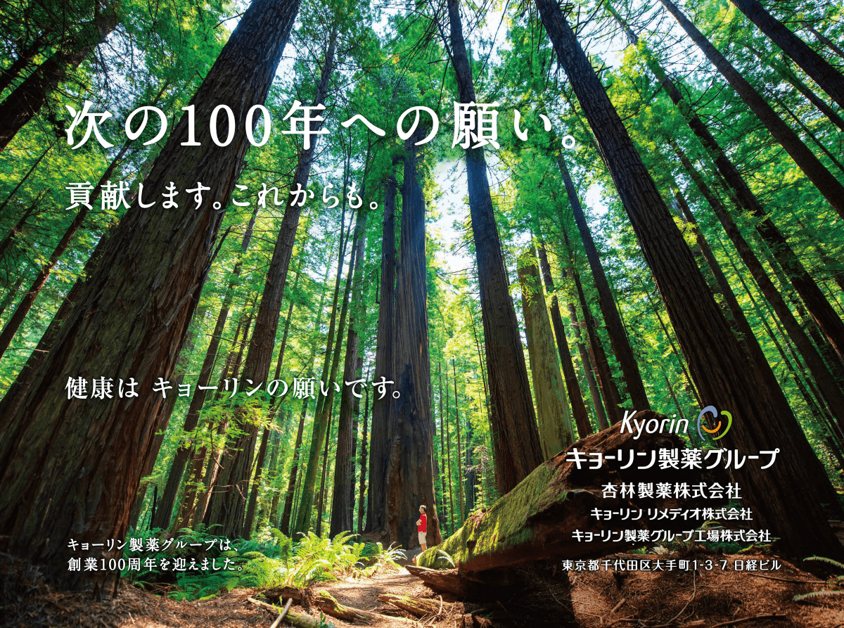
Corporate advertising
The Kyorin Group strive to build good impression of corporate image through corporate advertising.
Supporting a hands-on science event for children
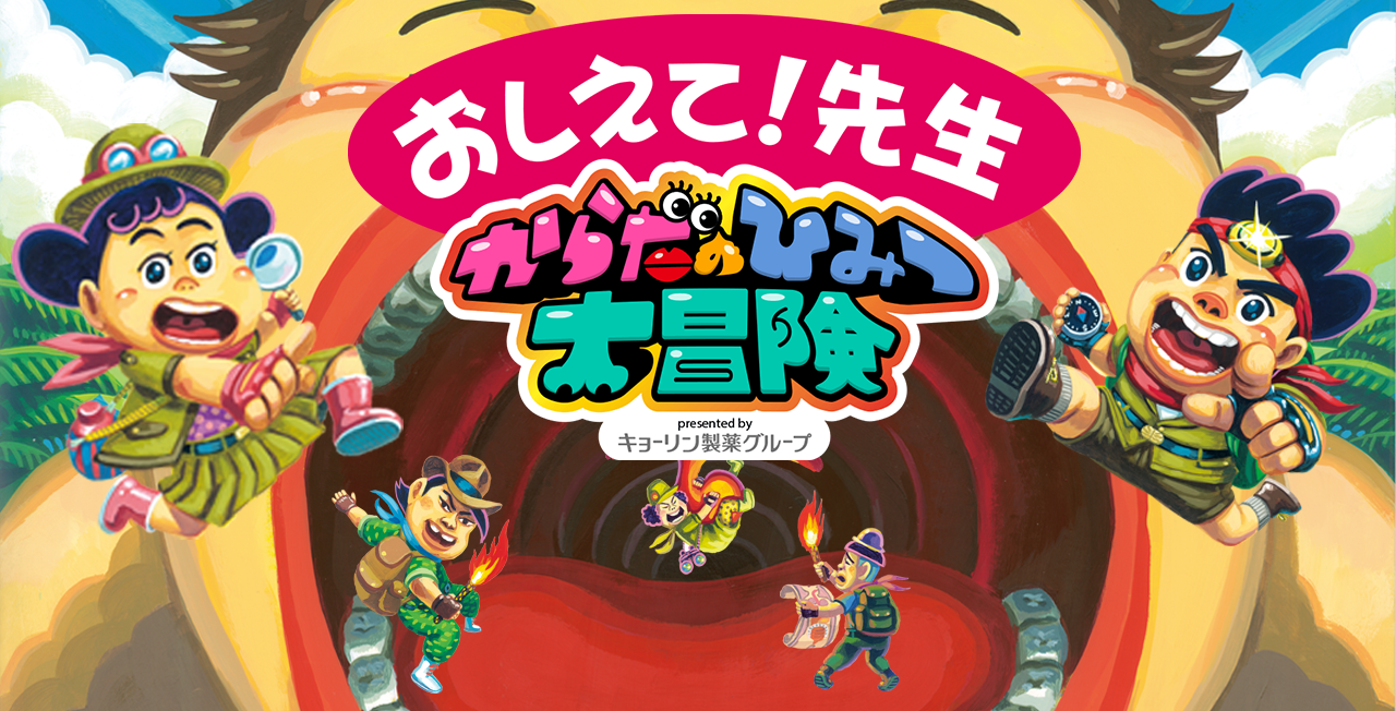
The Kyorin Group has supported the “Kyorin Group Presents the Great Adventure for the Karada-no-Himitsu (the Body’s Secrets)” program since 2016, with the idea of supporting healthy lives for children, who will lead the next generation.
In fiscal 2018, we launched the event-linked website Teach Me—Doctors Explain the Great Adventure for the Karadano-Himitsu, which provides videos for children describing the body’s workings and explaining diseases to deepen their interest and motivate them to learn more.
Signboard
The advertisements below are displayed to enhance the company visibility.
Advertising board
Advertising board are display at Otemachi station.
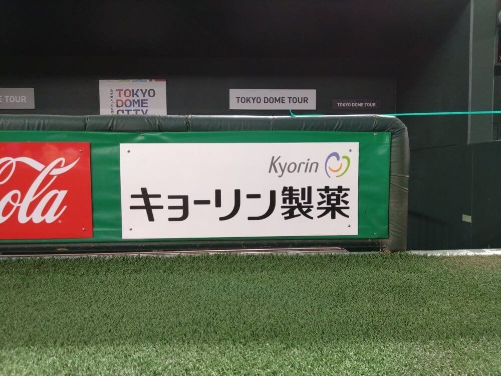
Tokyo Dome
Brand symbol are displayed at fences in front of dugout at first and third base from 2008.